New CSS, Who Dis? (2024 edition)

It's been just over four years since my last significant site redesign, and today I'm releasing a new site update.
This isn't as significant an update, and retains the layout that I've been using since then, but replaces a lot of the theming.
In recent years I've been deprioritising my personal website (and the many IndieWeb-y things I want to do with it), both because I have far too many other projects as well as life stuff, and far too many hours in the day.
This also hasn't been helped by the fact that my site takes an age to build. Over the weekend I did a significant upgrade from an ~8 year old SSD to a new M.2 SSD, and my site still takes ~104 seconds to build. Hugo's known to be blazing fast, so if even that struggles with my site, I know I'm in trouble.
hugo output for building my site
% ./hugo
Start building sites …
hugo v0.100.1-0afb4866e345d31cbbcbab4349e43f1d36122806+extended linux/amd64 BuildDate=2022-06-01T10:11:48Z VendorInfo=gohugoio

                   |  EN
-------------------+--------
  Pages            | 84049
  Paginator pages  |  2769
  Non-page files   |     2
  Static files     |    45
  Processed images |     0
  Aliases          |  2674
  Sitemaps         |     1
  Cleaned          |     0

Total in 103442 ms
./hugo  241.77s user 15.77s system 248% cpu 1:43.67 total
I've thought over the last couple of years that "I won't invest any time in my personal site, as I'll rebuild it soon", as I've wanted to migrate from a static site to a dynamic site. But that's never made it up the very long TODO list, so I thought that I should make some minor tweaks over the weekend, which are live as of this post landing.
Appearing on Go Time tomorrow provided a bit of a nudge towards getting the site redesign finished, after starting it ~6 weeks ago.
CHANGELOG
The new site involves a few changes:
- Migrating to the colour scheme I'm using in all my other tools
- Re-introducing code block segments that fit the width of the page, but the code still sits within a readable portion (which I internally refer to as "max-width'd")
- Using the Atkinson Hyperlegible font
- Cleaning up some wildly inconsistent
font-sizes for<h1>/etc elements - Rethinking the colours used by each part of my site (+ using CSS variables)
Colour scheme
I've been officially migrated to using the Srcery theme in my Neovim and terminal setups since January, and I'd been running it for a few weeks leading up until that point. I really like my site being consistent look + feel to what I run locally, and so it's been bugging me for months that it's inconsistent with what I see in my terminal. In recent months I've modified my CV and the dependency-management-data website to use the colour scheme, and I'm glad it's now finally consistent here.
Code blocks
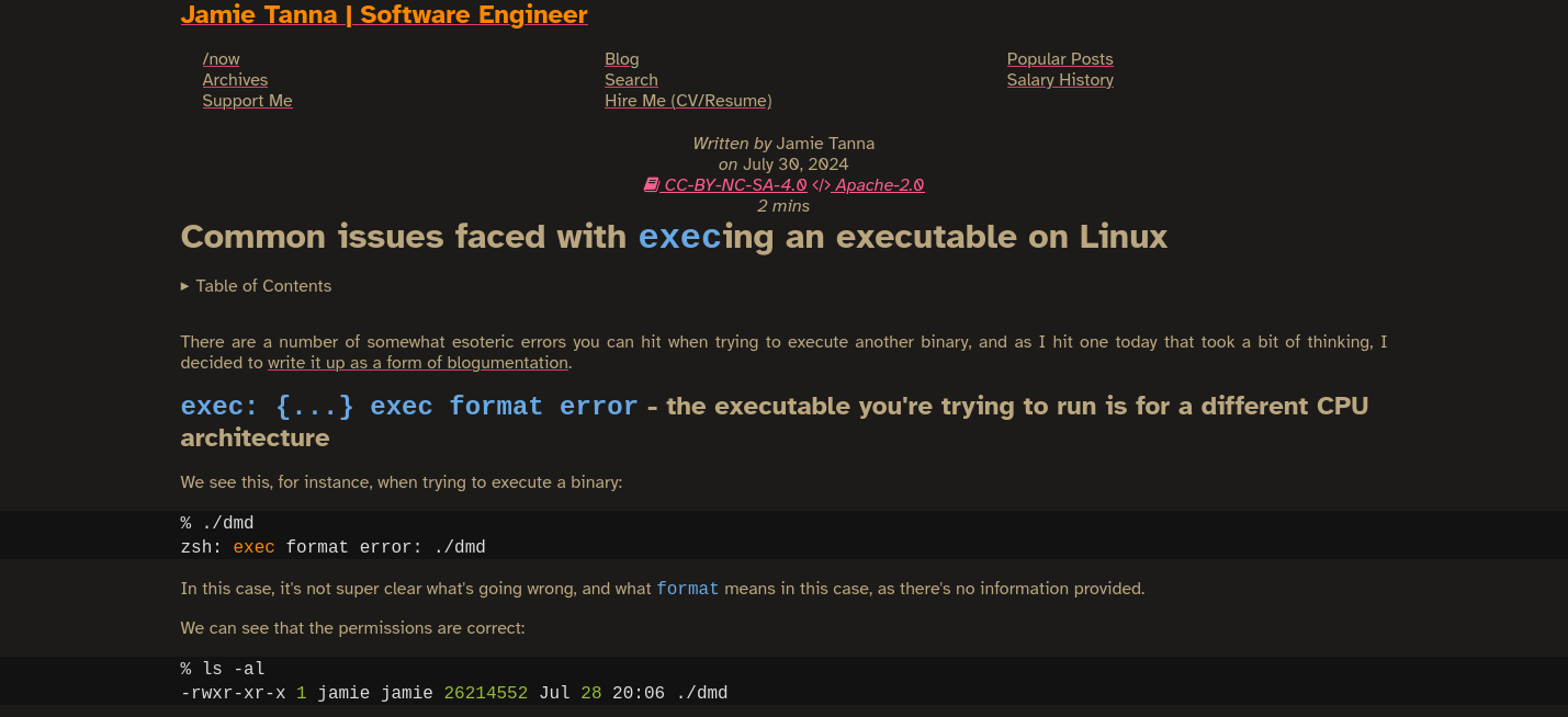
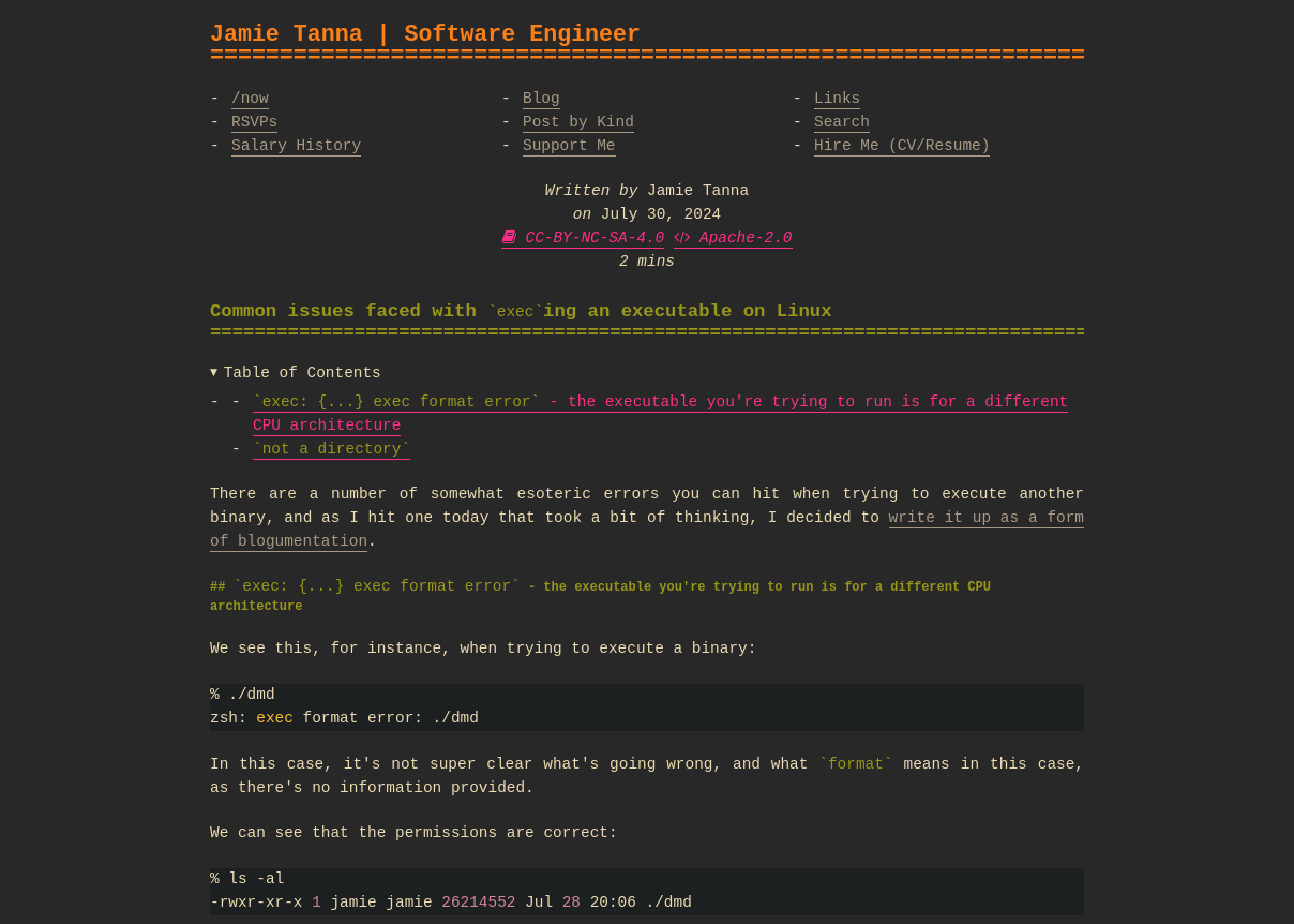
Something I've missed from my site (pre-2020 redesign) was the way that code blocks introduced a visual break in the view, which you can see more clearly below.
Before:

After:

It's been noted that it may not be the most accessible at times, so I'll have to take that under advisement.
Extended Atkinson Hyperlegible
Despite personally preferring to read monospace fonts, I realise that's not everyone's view, so I'm also using this as an opportunity to migrate to a nice sans-serif font.
I've been a fan of the Atkinson Hyperlegible font since Terence Eden first mentioned it in his post, An update to the Atkinson Hyperlegible font.
I've added it to my CV in the past, and as part of this release took the opportunity to use it for all non-code content.
Feedback
Like it? Hate it? Ambivalent? Found something buggy? Lemme know.
